

Numbers and analytics are an everyday part of sales and project work, but you shouldn’t have to click them together manually. That’s precisely why we’ve developed a new feature for the Daylite Plus Package: a flexible dashboard that allows you to organize your most important metrics however you like.
Your dashboard, your structure
The new dashboard is based on a simple yet powerful principle: tabs and widgets.
Create up to 10 tabs, such as one for sales, one for your team, and one for yourself.
In each tab, you can place as many widgets as you like. These are small graphical reports that display the relevant data for that area.
This way, you won’t end up with a rigid, standard report. Instead, you’ll have a dashboard that adapts to the way you work, not the other way around.
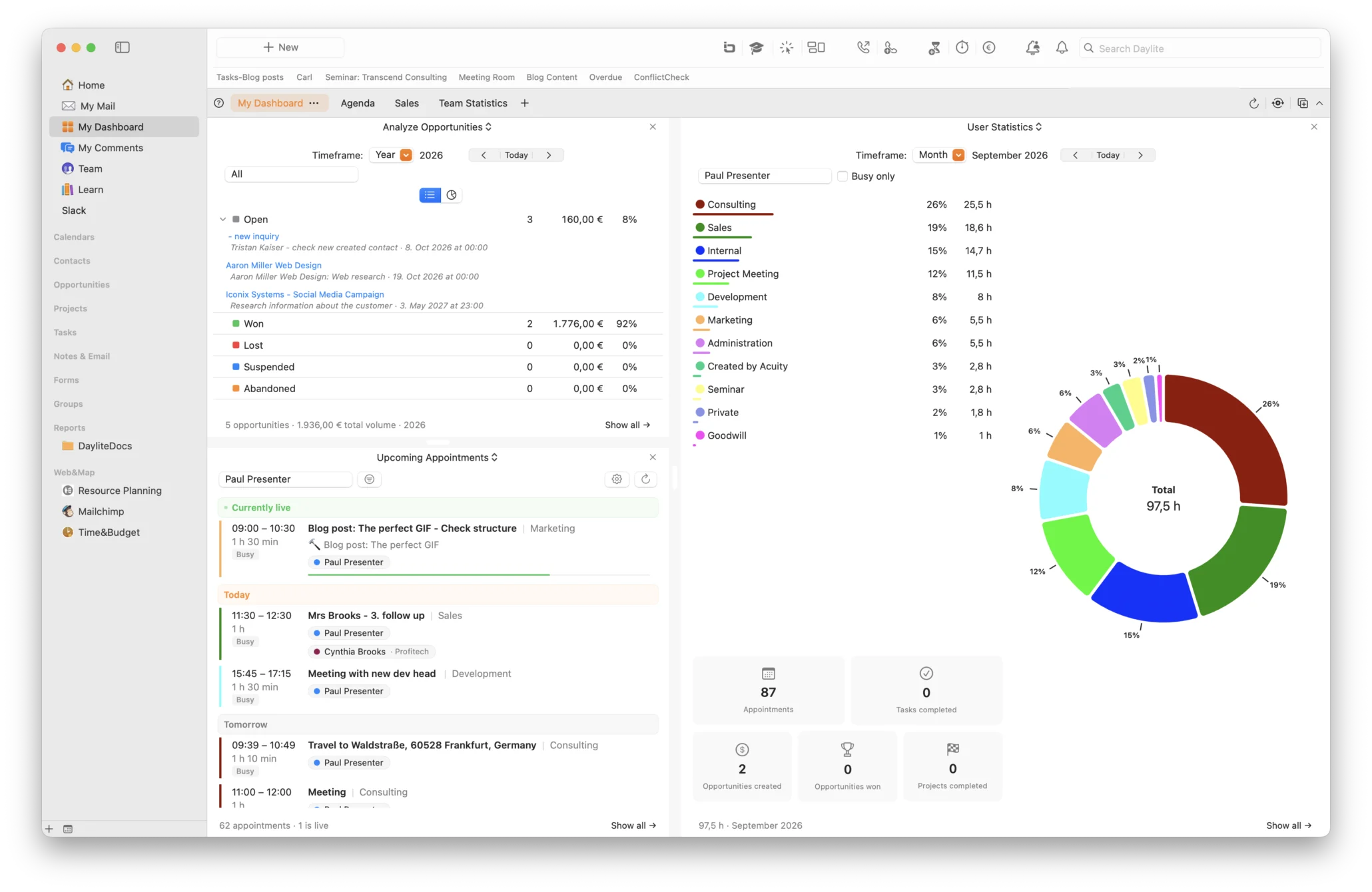
Full control in every widget
Full control in every widget
All widgets share a few practical, basic features.
User selection: For each widget, you can select one or more Daylite users, which is perfect for keeping track of individual employees, entire teams, or yourself.
Time period selection: You decide the time period over which the data is analyzed: days, weeks, months, or years.
Jump directly to the details. With most widgets, a single click takes you directly from the graphical analysis to the corresponding list view in Daylite without any detours.
The widgets at a glance
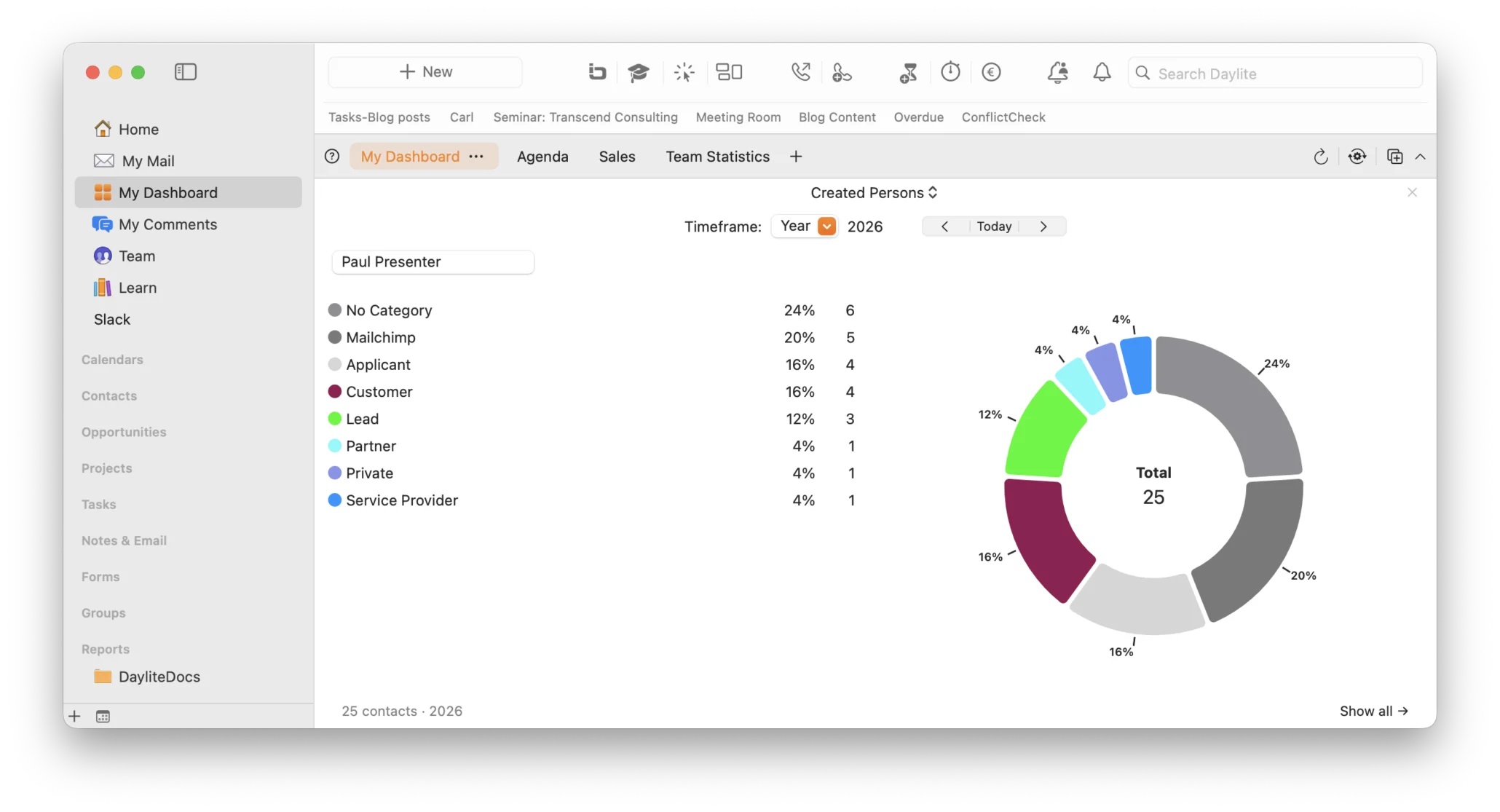
Created persons: Shows you how many contacts were created during the selected time period in a donut chart, broken down by category (contact person, prospect, or decision-maker). Clicking on a category takes you directly to the corresponding list in Daylite. This lets you immediately see whether your new contact acquisition is heading in the right direction.
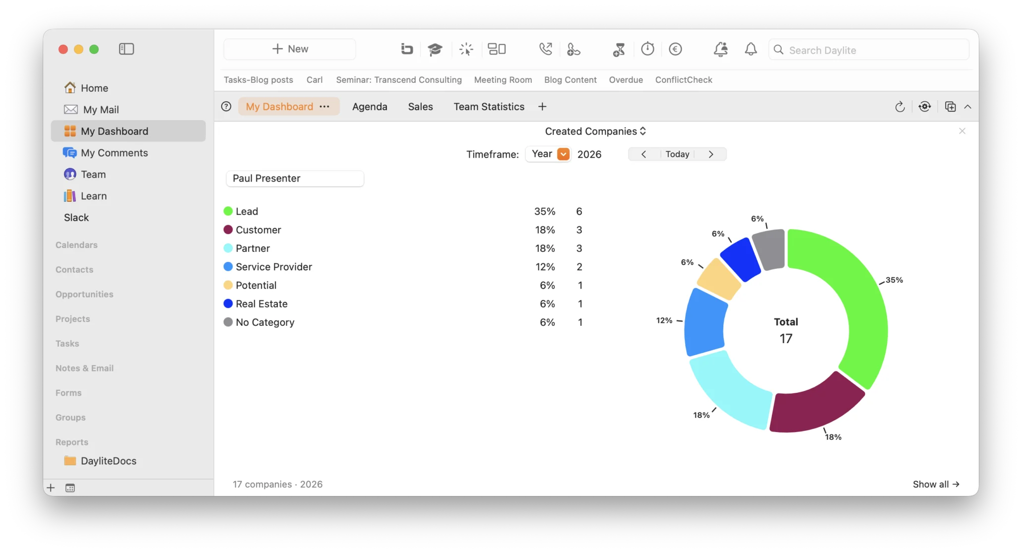
Created companies works on the same principle as the People widget, but for newly created organizations. There is also a breakdown by category and a direct link to the detailed list.
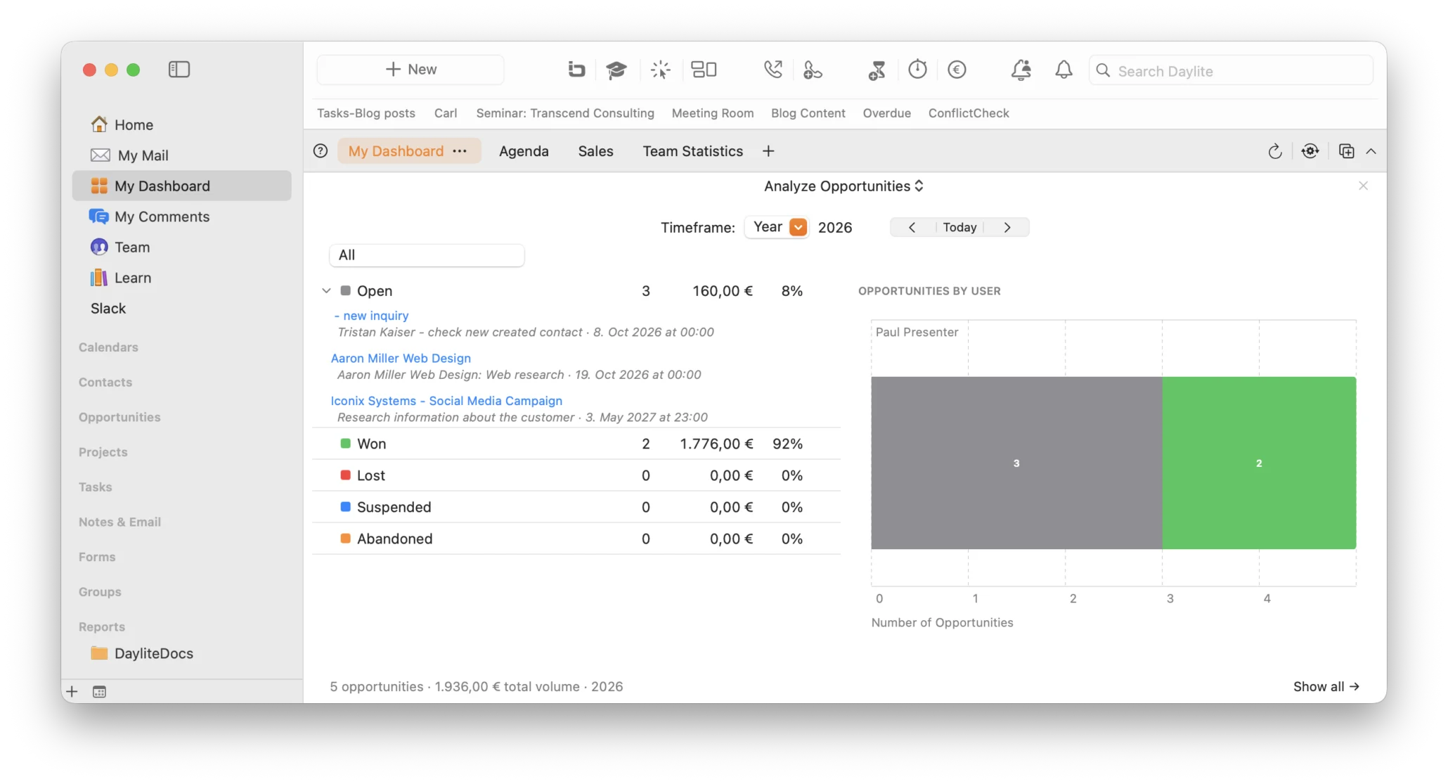
Analyze opportunities: The heart of sales: Sales opportunities are broken down by status: Open, Won, Lost, Rejected, or Postponed. Each status shows the number of opportunities, revenue, and percentage share. An additional bar chart shows how the opportunities are distributed among individual users. This lets you see at a glance how full the pipeline is and who is working on what.
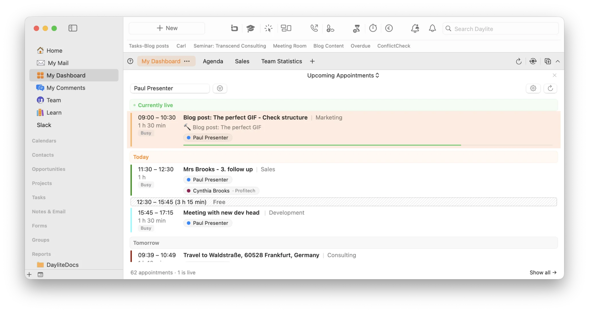
Upcoming appointments: A clear list of current and upcoming appointments for the selected users, grouped chronologically by „Currently live,” “Tomorrow,” and the following days. Each appointment shows the time, title, category, and duration. This lets you see at a glance who is available for a meeting and when.
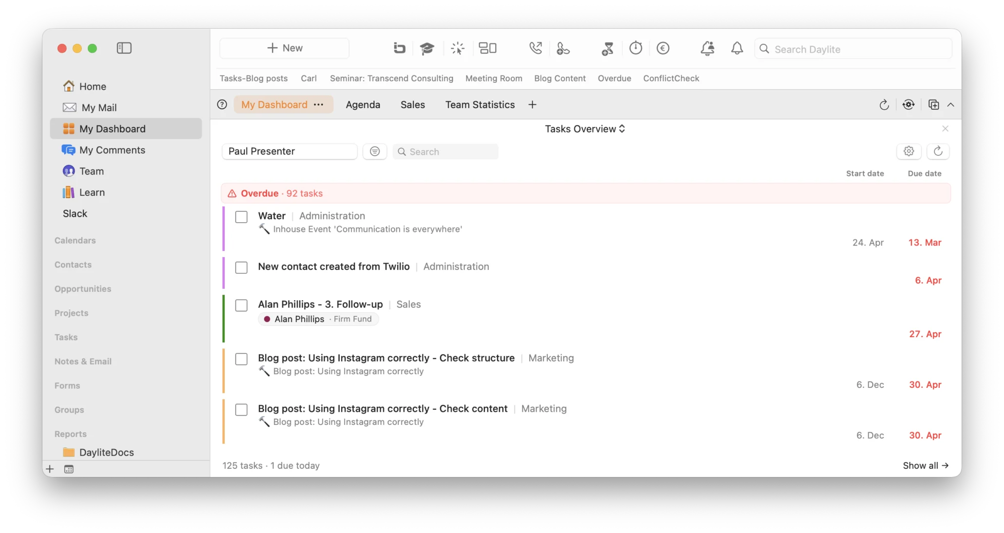
Tasks overview: displays the open tasks for the selected users, grouped by due date – from “Overdue” to “Today” and beyond. The priority, assigned user, and estimated time required are immediately visible, and overdue tasks are highlighted in color. This feature is perfect for team leaders to see where things are getting stuck.
Incoming and outgoing calls: This feature displays the number and category of incoming and outgoing calls during the selected time period, such as sales, support, or follow-ups, as a stacked bar chart. It includes total counts and percentage distribution. This feature requires phone calls to be recorded as appointments and marked as incoming or outgoing.
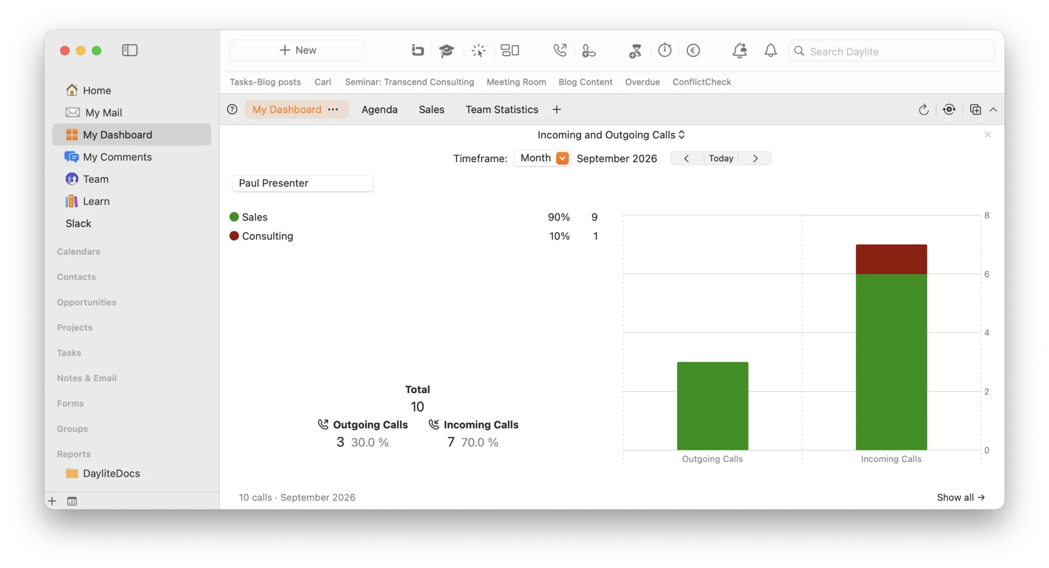
If you use Fone&Text, this tagging happens automatically, so the widget is ready to use with no extra effort.
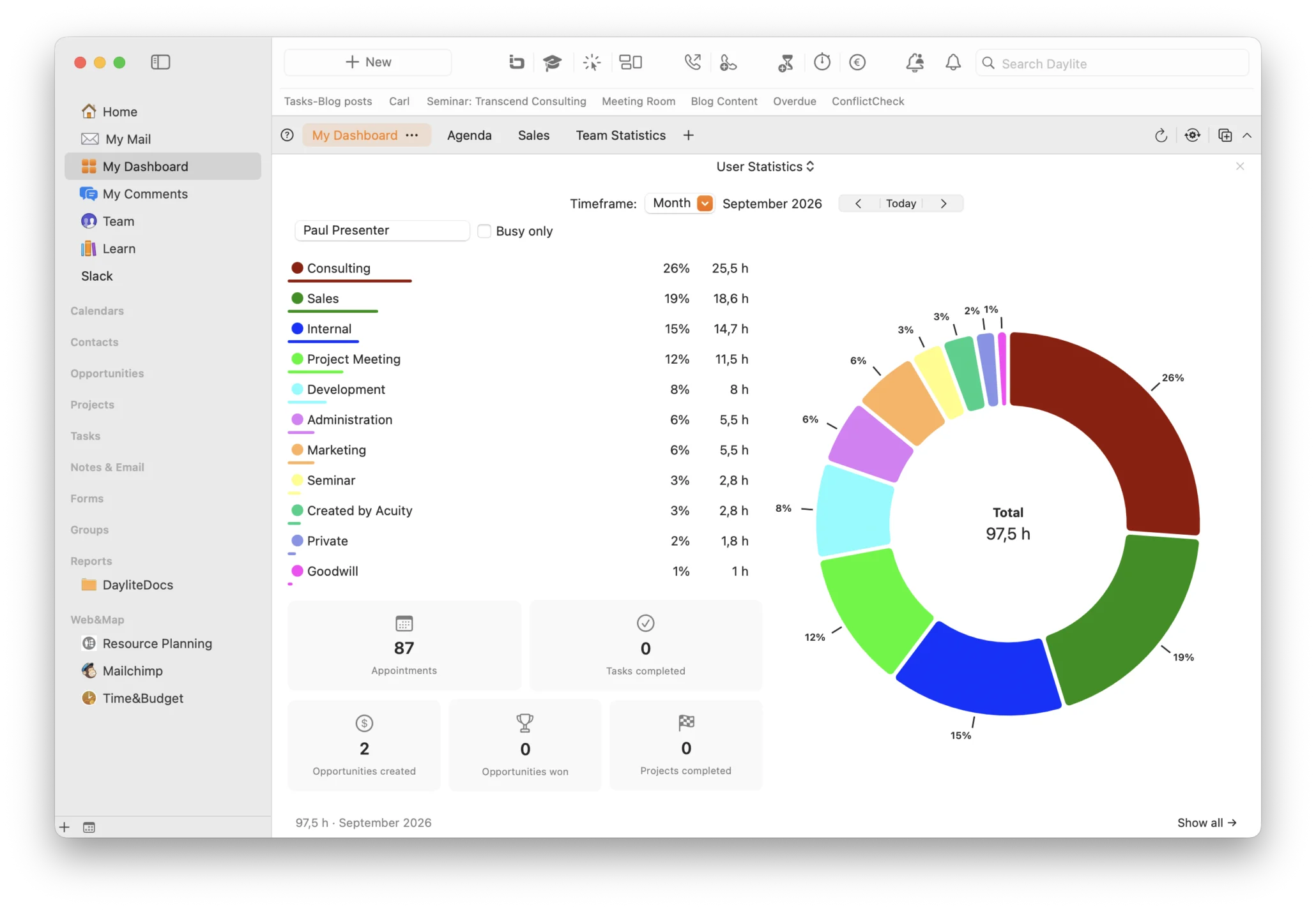
User statistics: The most comprehensive widget in the suite. It summarizes how the tracked time is distributed across appointments by category for the selected users and time period as a donut chart. It also includes compact metrics tiles showing the number of appointments, completed tasks, opportunities created and won, and completed projects. It’s a true mini-report at a glance, ideal for weekly or monthly team reviews.
Who will benefit from the New Dashboard?
Whether you’re a sales manager, team leader, or solo worker, this dashboard is for you. With the new dashboard in the Daylite Plus Package, you can see at a glance what’s happening in your Daylite without having to export reports or compile numbers manually.
It’s free for all Plus Package users
The best part? The complete dashboard, with all tabs and widgets, is a new free feature for Daylite Plus Package users. No additional purchase or upgrade is required. If you’re already using the Plus Package, you can get started right away.
Don’t have the Plus Package yet? Switch now!
If you’ve been using Daylite without the Plus Package, you won’t want to miss out on this and other powerful features. Contact us – we’d be happy to show you how to get more out of Daylite with the Plus Package.
Want to get started with the dashboard right away? Our HelpCenter article explains how to set up your dashboard: What are Dashboards in Daylite?

